Corporate Elegance: George Nelson’s Visual Vocabulary of Versatility
by Robert Gordon-Fogelson
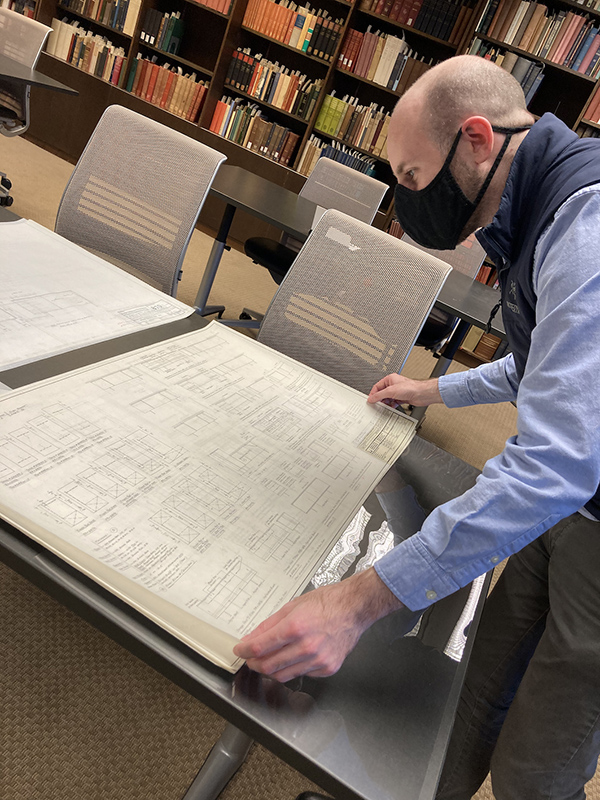
With the generous support of a Decorative Arts Trust Research Grant, I visited Syracuse University’s Special Collections Research Center (SCRC) to conduct research on the topic of Mid-century corporate design (figure 1). Building on my doctoral dissertation in Art History, which I recently completed at the University of Southern California, my current research concentrates on the convergence of design and business and the resulting formation of a pervasive corporate visual style in the mid-20th century.
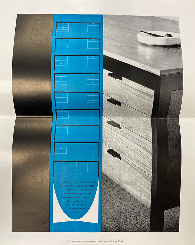
My research in Syracuse focused on designer George Nelson, who, through his work for the Herman Miller furniture company and other manufacturers, helped shape the visual and material culture of the American workplace. I became particularly interested in the language that Nelson and his clients used to promote their designs for the office. A 1960 advertisement for Herman Miller’s Executive Office Group (figure 2) described the suite of furniture as “a new means to elegance in the office” and an extension of Herman Miller’s “versatile vocabulary” of workspace solutions. What did the word “elegance” mean in the context of corporate culture, I wondered. What did corporate elegance look like? And what work did it do for corporations preoccupied with creating versatile office environments?
Derived from the Latin eligere, meaning “to choose,” elegance was not simply synonymous with opulence or beauty. In the language of Mid-century design and business, it also carried connotations of distinction and discernment—of office environments whose furnishings had been carefully selected, arranged, and even accessorized. In corporate design, then, elegance served a practical purpose through its associations with flexibility, modularity, and productivity. In other words, the modern office became increasingly elegant as its versatility grew more apparent, evident in furniture units that could be reconfigured, refinished, and re-accessorized to suit the changing needs of the modern workplace.
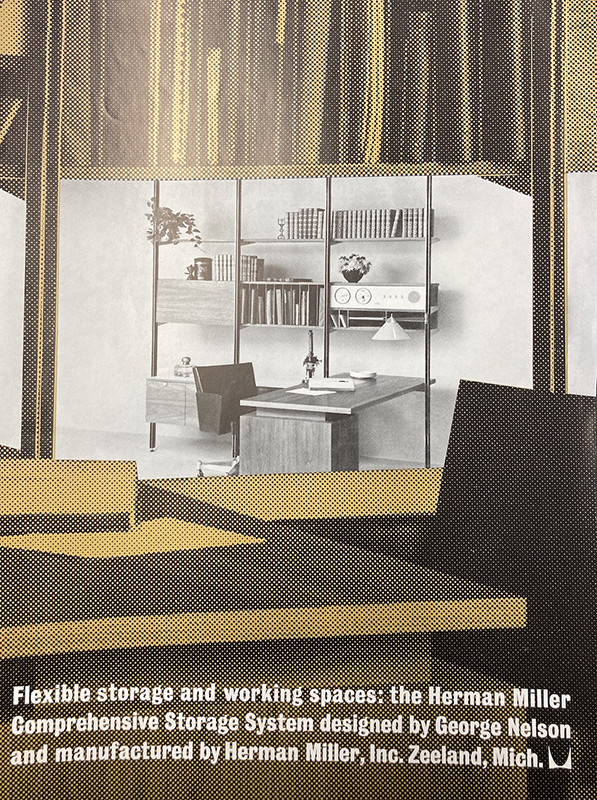
During the 1950s and 1960s, Nelson produced numerous designs that employed elements of interchangeability, modularity, and customizability to help create elegant office environments. The drawings and promotional materials located at the SCRC offer a glimpse into this visual vocabulary of versatility. The Executive Office Group, based on a design concept introduced by Gilbert Rohde in 1942, consisted of drawers, pedestals, and tabletops offered in a variety of finishes that could be configured to suit a worker’s particular needs. The Comprehensive Storage System (figure 3) combined poles, shelves, doors, drawers, and panels to provide flexible storage solutions for both executive and domestic spaces. Nelson even designed a Service Module System for the Howard Miller Clock Company, an offshoot of Herman Miller, which extended this versatile aesthetic to the home, or at least those areas of the home reserved for domestic work. Six basic modules, available in seven color combinations and featuring elements such as radios, clocks, storage cabinets, and clothes dryers, could be combined to form 24 different built-in units suitable for bathrooms, dressing rooms, kitchens, and laundry rooms.
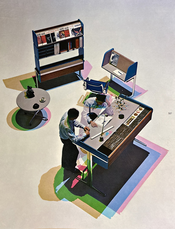
Among Nelson’s most infamous contributions to corporate design was Herman Miller’s Action Office (figure 4), a predecessor of the cubicle systems that became ubiquitous in offices during the last decades of the 20th century. Created in collaboration with engineer Robert Propst, the Action Office (and the many cubicle systems that followed it) has been criticized for contributing to the dehumanization of the modern workplace. But the first Action Office was, according to one pamphlet, intended as an expression of “practical elegance.” Based on rigorous research of modern working methods, the system’s components were designed to support a variety of postures, facilitate a range of interactions, and provide an array of storage solutions. Far from the discomfort and dissatisfaction commonly associated with office work, the Action Office was intended to stimulate “physical and mental vitality.” Like Nelson’s other flexible furniture systems, it was promoted as a means to “functional elegance,” a way to aestheticize versatility and to make it do the important promotional work required of the modern corporation.
I am grateful to the Decorative Arts Trust for the opportunity to visit Syracuse and learn more about Herman Miller, Nelson, and the Mid-century pursuit of corporate elegance. This research will support my efforts to transform my dissertation into a book, during my role as a Tyson Scholar at Crystal Bridges Museum of American Art.
About The Decorative Arts Trust Bulletin
Formerly known as the "blog,” the Bulletin features new research and scholarship, travelogues, book reviews, and museum and gallery exhibitions. The Bulletin complements The Magazine of the Decorative Arts Trust, our biannual members publication.


