


Grasping Color: A Material History of Color Charts
by Kate Burnett Budzyn
Anyone who has thumbed through a paint deck at a hardware store will know the simultaneously delightful and agonizing experience of selecting a color. Butter yellow, lilac grey, eau de Nil, chocolate: infinite hues and their synesthetic names cascade, offering worlds of possibility and pleasure from the space of their small squares on a card.
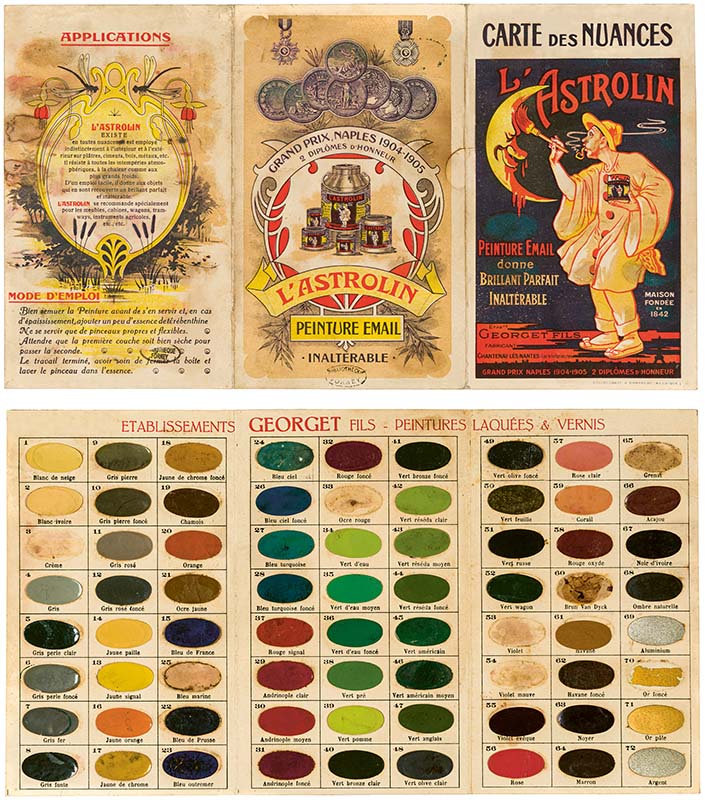
Astrolin Color Card, Établissement Georget Fils Peintures Laquées et Vernis, Chantenay-Lès-Nantes, c. 1906, pamphlet, 16 x 9.5 cm, 2 folds, Bibliothèque Forney, Paris, call number RES ICO 8104. Credit: Bibliothèque Forney, Paris.
The reference tool at the center of this experience—the color chart—accomplishes a complex act of translation in humble form. As anthropologist and color historian Anne Varichon explains in her new book, Color Charts: A History, published earlier this year by Princeton University Press, these objects have existed across the modern era because of a universal need to communicate something that is very hard to communicate. Color is impossible to describe, except in terms of comparison. “Color is a characteristic that evades language as well as memory,” Varichon writes, “and can only be grasped by example” (15).
Varichon’s seven chapters, organized by era, deal frequently with technical challenges of producing not just the substance being represented in color charts—from 1780s Cévennes silk to 1930s car enamel—but also the charts themselves. Across the history of color charts, some products, like varnishes, more easily represented themselves: they could be applied directly as samples. Other substances, like urine and dyes, were subject to fading, and some specimens, like feathers, were difficult to contain within the limited space of a chart. Authors and manufacturers thus constantly experimented with the form, leaving behind a body of historic ephemera that is wild in material range and visually spectacular. The book’s large, gorgeously printed reproductions allow readers to interact with these objects on an intimate level.
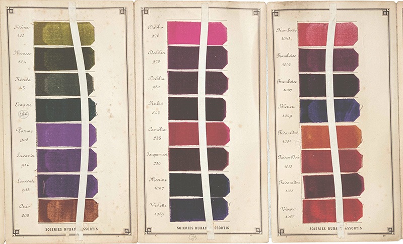
Detail of color chart of silk velvet ribbons, G.G. & Cie, France, leporello, 24 x 13 cm, 31 panels, late 19th century, Bibliothèque Forney, Paris, inv. RES ICO 8398. Credit: Bibliothèque Forney, Paris.
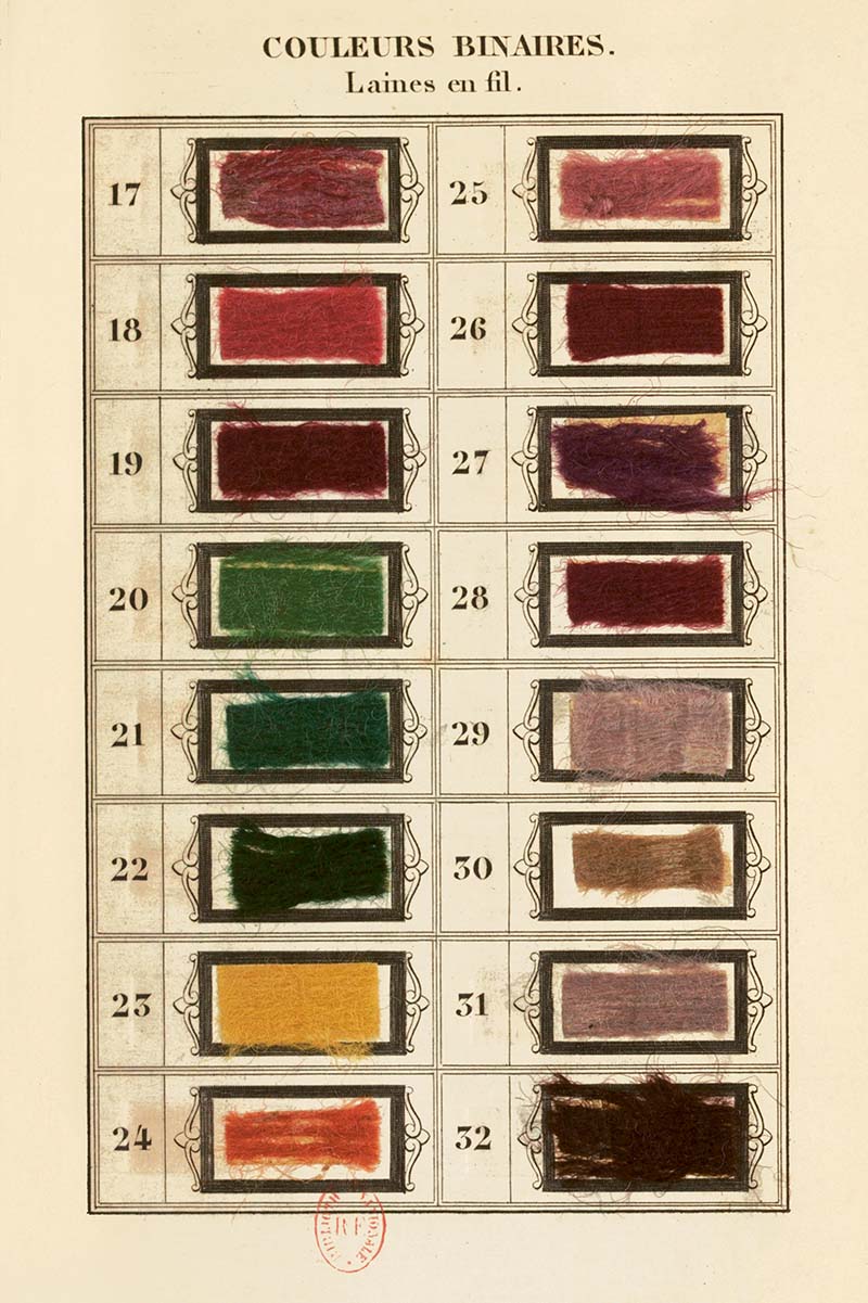
𝘈𝘳𝘵 𝘰𝘧 𝘋𝘺𝘦𝘪𝘯𝘨 𝘞𝘰𝘰𝘭𝘴 𝘪𝘯 𝘍𝘭𝘦𝘦𝘤𝘦, 𝘠𝘢𝘳𝘯, 𝘢𝘯𝘥 𝘍𝘢𝘣𝘳𝘪𝘤𝘴, M. D. Gonfreville, Librairie Scientifique, Industrielle et Agricole Lacroix et Baudry, Paris, 1848, 873 pages, Bibliothèque nationale de France, Paris. Credit: Bibliothèque Nationale de France, Paris.
During the enlightenment, Varichon explains, naturalists sought means of observing, identifying, and describing the color of specimens consistently across disciplines. The Werner-Syme nomenclature finally accomplished this task in 1814. A collaboration between a mineralogist (Abraham Werner) and a botanical artist (Patrick Syme), the printed catalog offered names for 108 colors found in nature, accompanied by small, color-stable squares of paint that could be easily reproduced. Each entry listed animal, plant, and mineral examples of a given color, resulting in terms that could be used descriptively in combination with one another.
Here enters what one might call the poetry of color naming, a linguistic process that has in large part been facilitated by color charts. Bringing tones and shades into visual conversation with one another, charts allow us to imagine the ineffable sensory experience of a single color as being part of a given material world. Something singular becomes relative and thereby communicable; we attach metaphors to hues. Darwin, for example, used the Werner-Syme nomenclature to describe “primrose yellow sea slugs” and a “vermillion red spider” during his trip to the Madeira Islands. Through color, disparate earthly phenomena come into direct relationship. As Varichon writes, “Syme understood that the color chart could evoke wonder. He knew how to turn his nomenclature into something sublime, a landscape of color and an epic in praise of Creation” (38).
𝘛𝘩𝘦 𝘊𝘩𝘦𝘮𝘪𝘴𝘵𝘳𝘺 𝘰𝘧 𝘋𝘺𝘦𝘳𝘴, 𝘕𝘦𝘸 𝘛𝘩𝘦𝘰𝘳𝘦𝘵𝘪𝘤𝘢𝘭 𝘢𝘯𝘥 𝘗𝘳𝘢𝘤𝘵𝘪𝘤𝘢𝘭 𝘛𝘳𝘦𝘢𝘵𝘪𝘴𝘦 𝘰𝘯 𝘵𝘩𝘦 𝘈𝘳𝘵 𝘰𝘧 𝘋𝘺𝘦𝘪𝘯𝘨 𝘢𝘯𝘥 𝘗𝘳𝘪𝘯𝘵𝘪𝘯𝘨 𝘍𝘢𝘣𝘳𝘪𝘤𝘴, Oscar Piéquet, 402 pages, Paris, 1892, Bernard Guineau collection, Ôkhra-Ecomuseum of Ocher, Roussillon. Credit: Ôkhra-Ecomuseum of Ocher, Roussillon.
Emphasizing industrial history over social history, Varichon suggests that there was, in fact, another mid-19th-century development that radically changed the trajectory of color charts: the invention of aniline dyes. No longer focused on identifying and stabilizing natural pigments, many industries faced an ever-expanding set of chemical innovations to represent in chart form. Companies constantly improvised new methods of binding, containing, and packaging their vast arrays of color samples. Across the late 19th and 20th centuries, market competition and consumer culture drove proliferating forms of color charts as advertisements; they came to represent the infinitely profitable force of choice. Given a range of color options, anyone buying bathtub enamel, lipstick, or barn paint, could feel like a kid in a candy store.
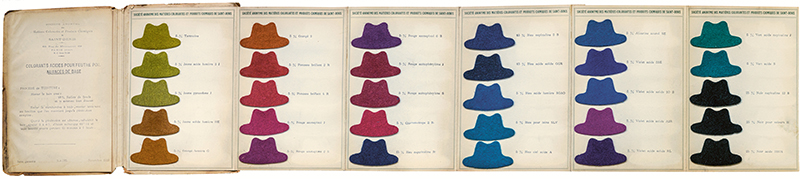
𝘈𝘤𝘪𝘥 𝘋𝘺𝘦𝘴 𝘧𝘰𝘳 𝘍𝘦𝘭𝘵 𝘗𝘪𝘭𝘦, 𝘉𝘢𝘴𝘦 𝘊𝘰𝘭𝘰𝘳𝘴, Base Colors, Société Anonyme des Matières Colorantes et Produits Chimiques de Saint-Denis, Saint-Denis, November 1930, leporella, 22 x 15 cm, 7 panels, Albi Couleurs, Association Mémoire, des Industries de la Couleur, Albi. Credit: Anne Varichon collection.
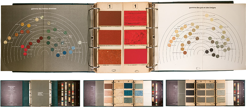
Linoleum Collection 1966-1967, Sarlino, Reims, France, 1966, binder, 36 × 30 cm, 14 pages, Bibliothèque Forney, Paris, call number CC RES ICO 8330. Credit: Bibliothèque Forney, Paris.
Those in need of a jolt of the pure, sensory joy that material culture inquiry can bring will find it in Color Charts: A History’s abundant, spectral offering of these peculiarly satisfying objects.
Kate Burnett Budzyn is a contributing writer for the Decorative Arts Trust Bulletin. She researches historic clothing and textiles and is the book review editor at Winterthur Portfolio.
About The Decorative Arts Trust Bulletin
Formerly known as the "blog,” the Bulletin features new research and scholarship, travelogues, book reviews, and museum and gallery exhibitions. The Bulletin complements The Magazine of the Decorative Arts Trust, our biannual members publication.
Click Images to Enlarge
Did you know that clicking on the images in Bulletin posts will allow you to get a closer look? Simply click on an image, and a larger version will open in a pop-up window.